I was involved in a competition at RIT, where we were challenged to redesign a charity's website and create a prototype of our new design. The organization, Water for South Sudan (WFSS), presented their current website, as well as the problems they had with the design of their current website.
1
PROBLEM
Water for South Sudan is a charity organization that is dedicated to providing clean water and other services, such as well rehabilitation and hygiene education, to South Sudan. Their website is used both for American donors to donate to the cause and for people who live in South Sudan to request services from WFSS.
The problem WFSS found with their website is that it was confusing for these two distinct audiences to find the correct part of the website that they needed.
2
PROCESS
We were given a week to create a new design and then present it to representatives from the charity. We started by thinking about the audience of the website and brainstorming different ideas for how to redesign the website and tackle the problem that the original website had. Then, we began by making different sketches to visualize the ideas we had for the redesign of the website.
Some Sketch Examples:
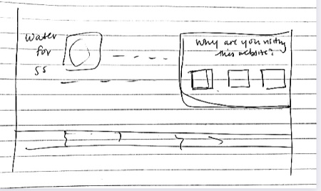
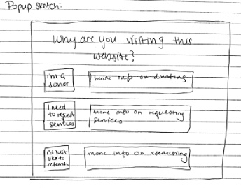
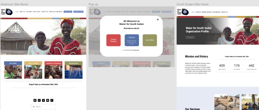
Utimately, our group decided to use a pop-up that would appear when a user first visits the site. This pop-up would ask the user why they were visiting the site and based on their choice, it would redirect them to the correct website (American site for donors, South Sudan website for others).
Next Steps:
- We made more sketches for the website, including what the homepage would look like and what the page for requesting services from WFSS would look like. We also finalized our popup sketch design, which ultimately was a combination of all of our groups' original ideas and sketches. We decided the popup should take up the entire page when a user first gets on the website, instead of having of having the popup be on top of the website, which was another possibility that we were thinking about. Ultimately, we chose it taking up the whole page because it was important to redirect people to the correct page and did not want people to ignore the popup or be confused about whether they actually needed to answer the question or not.
- After we had completed our sketches and made our final decisions on the popup and the home page and services page, we created a wireframe of our ideas utilizing figma. We took some of the pictures and sections from their original website, but reorganized and redesigned it.
- The last part of our design process was turning the wireframe in a prototype. We added links from the popup to the correct pages and also the links that would lead to the Services page.
- Once we completed our prototype, we were able to move into one of the last steps in our design process, which was user testing.
User Testing:
Description of User Testing
In order to test our prototype, we found five participants to use our prototype. We made five different scenarios and asked our participants to pretend they were a certain part of the audience that would use this website (for example a donor). Next, we presented our prototype to the participant and see if they clicked on the correct link and were brought to the correct website. We also tested to see if users could find their way from the homepage to the Services page (where users could request services from WFSS). Our scenarios and results are summed up in this document: User Testing
Findings From User Testing
- One participant explained that they did not read two of the buttons on the pop-up because they were too confusing.
- Another participant explained that the pop-up was quick and easy for them to use.
- As we observed participants using the website, we noticed that the path to the Services page was confusing and misleading.
Conclusions From User Testing & Changes Made
- The popup questions did work and having the popup ask the users about the goal was able to direct people to the correct site.
- The wording of the questions on the popup were important. They had to be simple so that people could quickly and easily read it, but still detailed enough to still direct people to the correct place.
- Having more links between pages was helpful for users to navigate to the desired page, and helped to make the path to the Services page less confusing.

3
OUTCOME
We created a prototype for our design of the website in figma: WFSS Prototype.
Ultimately, we did not end up winning the competition, and the organization chose another group's design over ours. But our group did receive an honorable mention, as they were impressed with our design, as well as our user testing.
4
REFLECTION
- The user testing was super helpful for pointing out certain flaws that we did not realize ourselves.
- Time management and planning were important for completing the prototype in time, as we only had a week to finish it. We stayed on track by creating a schedule and dividing up tasks between members
- Communication between team members about our ideas and plans was critical to the success of our project. We would meet everyday over zoom to discuss what we had finished so far, brainstorm more ideas together, and plan our next meeting.
- The winning design combined the two websites into one, which might be simpler than our design, but still easily direct people to the correct information.


